

The Dashboard summarises transactions inside the current perimeter. It is not a grade for the trader; it is a snapshot built from imported data and active filters.
Goal — Read the result from top to bottom and state the provider, period, number of trades and costs that compose it.
Documentation boundary — Visible metrics are documented by use and operational meaning; proprietary calculations, weights and code are not reconstructed.
First line: the perimeter
Check DEMO MODE, any Public Journal state, selected provider and period. Visitor mode hides some filters and write controls. A correct number from a different sample is still the wrong comparison.
Main KPIs
- Net P&L: result attributed to included trades after the components considered by the view.
- ROI efficiency: result relative to the operating base used by the metric; it is not a guaranteed account return.
- Total trades: number of transactions in the sample.
- Fees, Funding, Rebate: separate components when imported data makes them available.
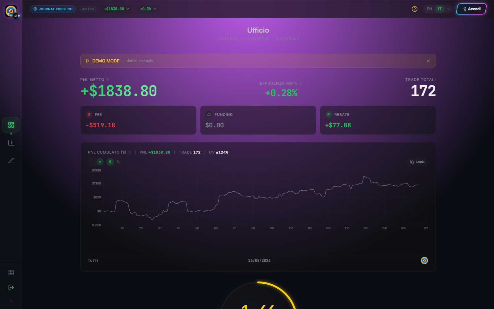
Curve and trade detail
The curve shows cumulative development inside the sample. You can change between currency and percentage and, where available, between line and dots. The visual change does not alter underlying trades.
Select a point or row to open the detail. Check symbol, side, size, times, prices and costs before adding interpretation. An excluded trade should not contribute like an included one; inspect its state in the detail.
Filters without losing the reference
Period, provider and pair filters narrow the same base. After each change, check that trade count and chart changed consistently. Compare periods using the same unit, capital definition and cost perimeter.
Observable result
The reading is complete when you can say: “I am looking at this provider, over this period, with these trades and these cost components.” For drawdown, distributions and evaluation, continue to Analytics.
Sources
- Ufficio Dashboard — operating interface.
- Synchronise and verify trades — data-base validation.
- Cyclepedia technical verification: check on 2026-08-25 of current Dashboard KPIs, curve, units, filters, table and trade detail.